London Youth Choirs
Unlocking young people’s potential through the power of choral singing
Background & Brief
London Youth Choirs is a youth arts organisation, that enriches the cultural life of young people through the pursuit of musical excellence and social change.
Children and young adults living or educated in London receive singing tuition and performance opportunities, which educate and inspire, build confidence, and develop skills in teamwork and leadership, all whilst championing inclusivity, empathy and understanding.
The LYC branding is looking tired. It doesn’t appeal to young people. We celebrate our 10th Anniversary in 2020 and need a total refresh that represents the vibrant personality of our singing and our members.
What We Did
Brand Identity
Brand Guidelines
Clothing
Print & Digital
Advertising
Website
When our team at LYC first saw the new branding we loved it! The symbolic ‘fountain of youth’ Y represents perfectly our members and mission.”
Nina Camilleri, Executive Director
Our Idea
When researching the world of chorale music and choirs, it was dominated by musical notes, treble clefs and other clichéd icons. Our challenge was to create a symbol that represented the young members in a unique way.
In mythology the Fountain of Youth is a spring that supposedly restores the youth of anyone who drinks or bathes in its waters. We liked the reference to youth and the restorative powers of the story. It was the perfect metaphor for the performances and powers of choral singing, and the inspiring work of London Youth Choirs.


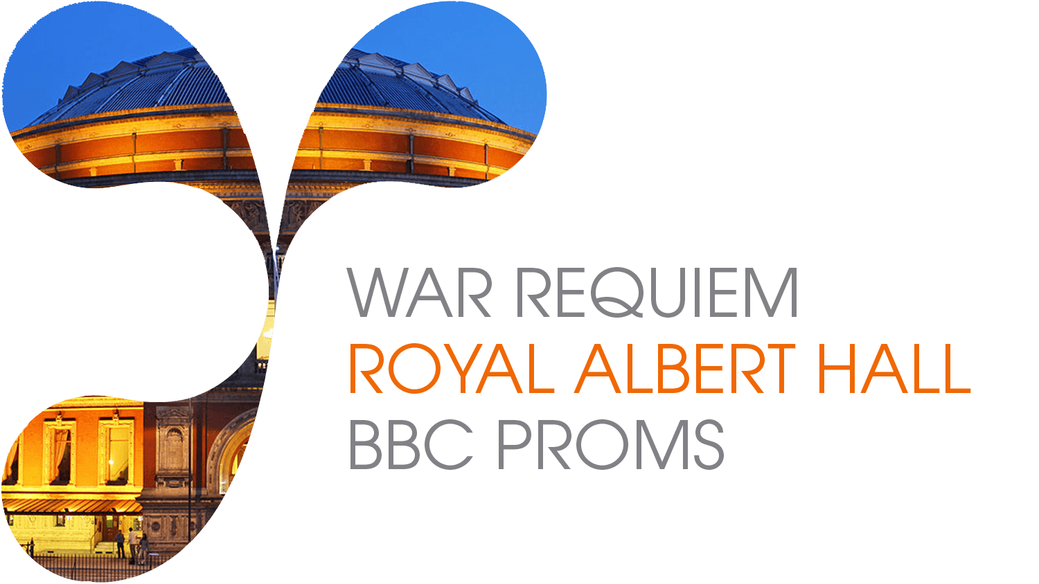
The Logo can be used as an image and descriptor on social media to promote performances, and link LYC to big names and big venues.

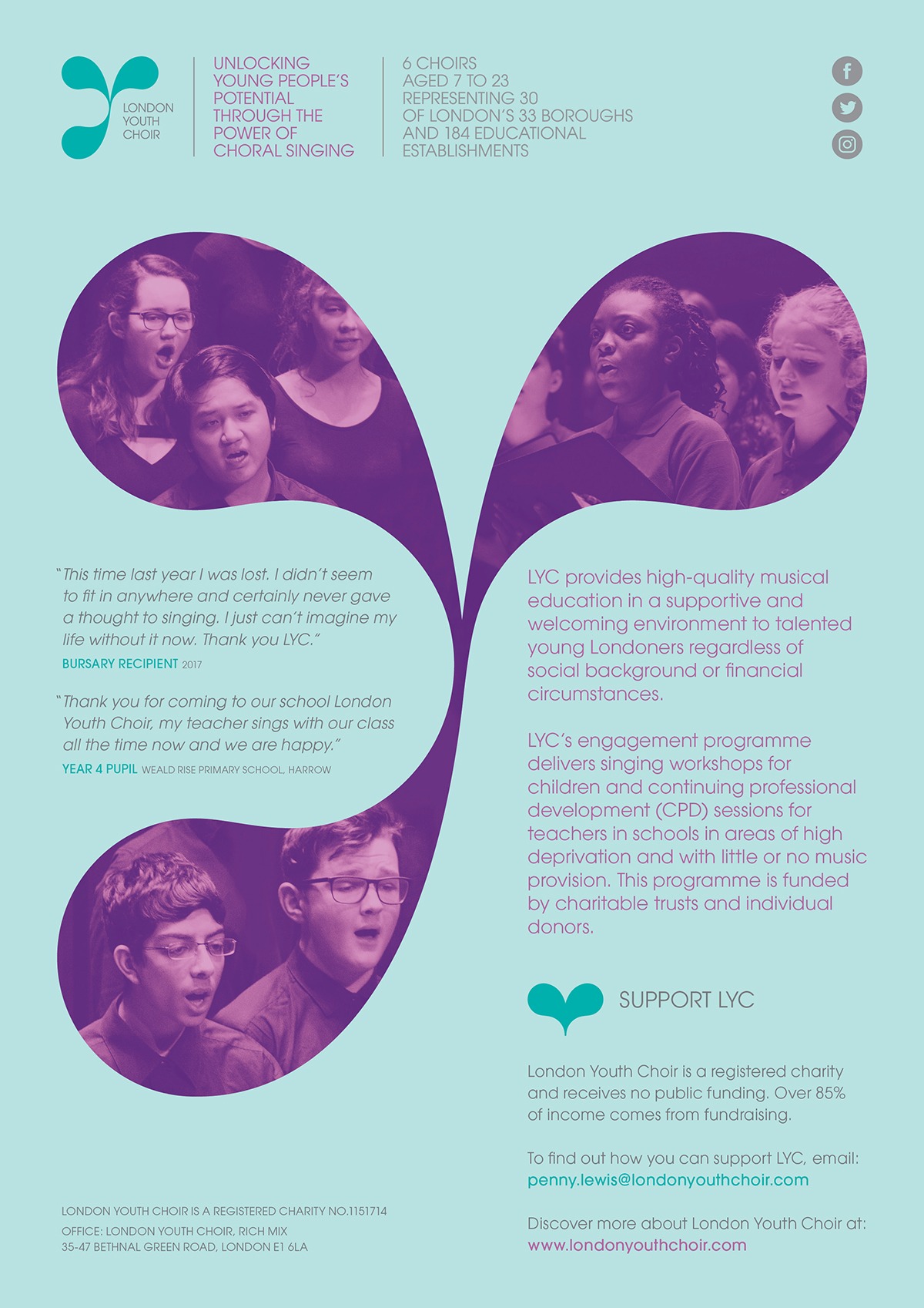
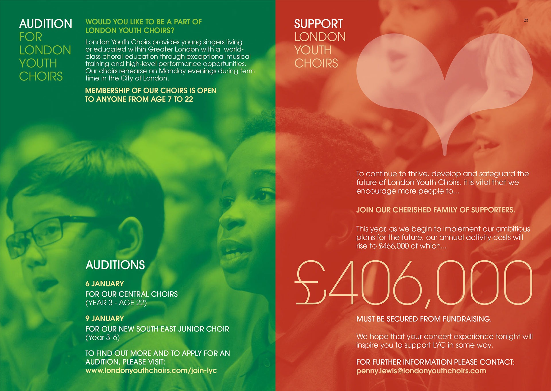
A number of concerts are held every year. The programmes are an opportunity to entertain, inspire and raise funds.
And…
LYC looks forward to 2020, its 10th anniversary and the expansion of choirs to cater for young people across all areas of London.


