LNER
An award-winning rebrand for the Department for Transport
Background & Brief
Prior to the announcement that LNER would go-ahead, we created branding, guidelines and systems, that post announcement were implemented by our team in London and the Virgin Trains East Coast in-house design team in York.
Transform Awards, Europe 2019
Gold: Best external stakeholder relations during a brand development project
Silver: Best visual identity from the transport and logistics sector
What We Did
Brand Guidelines
Livery
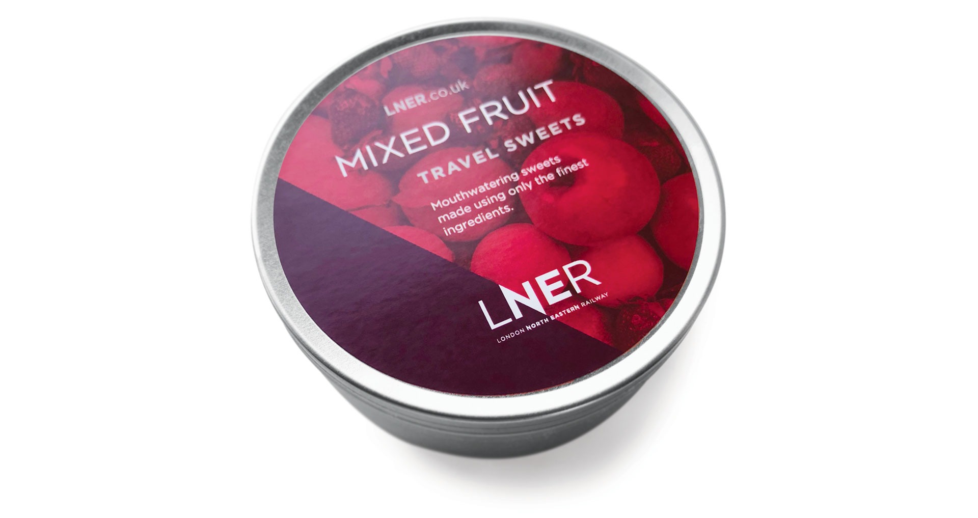
Print & Digital
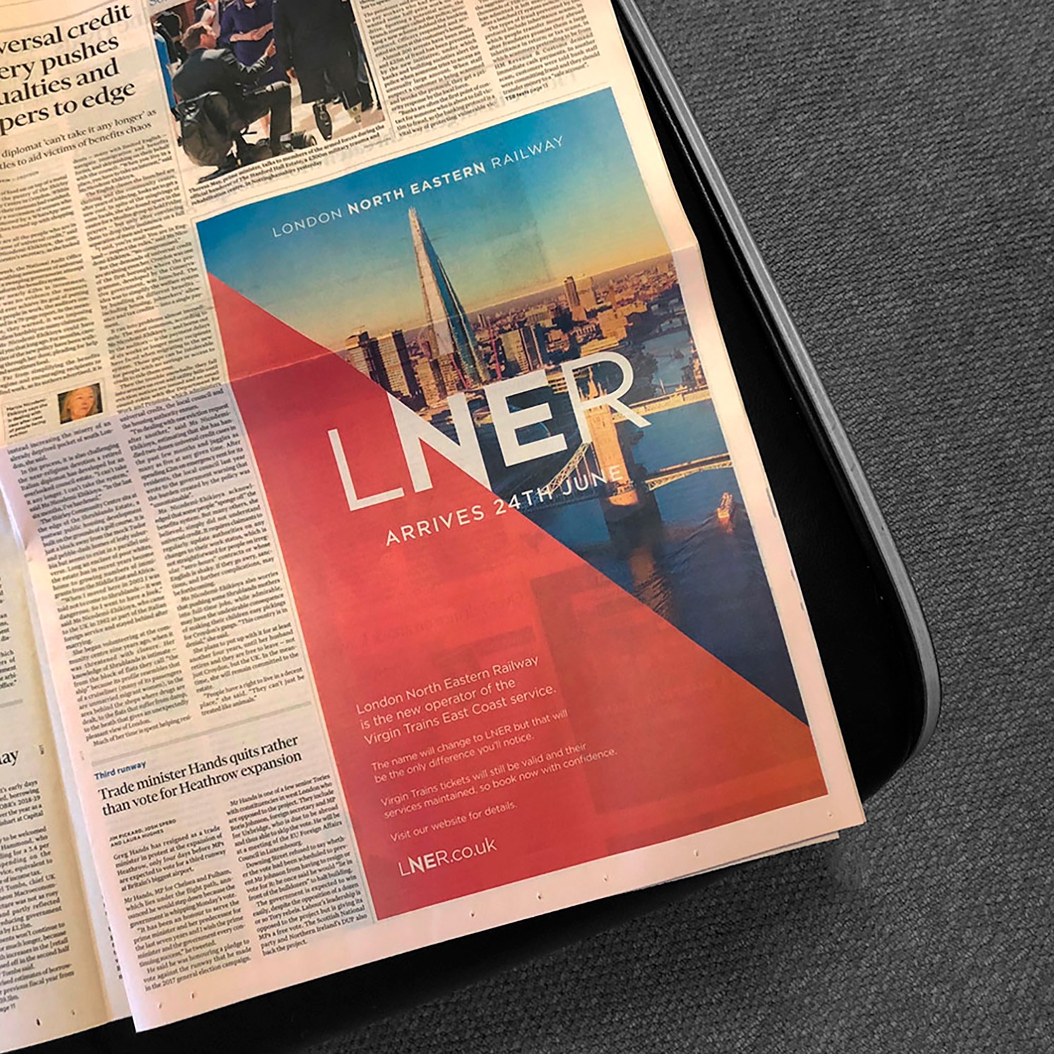
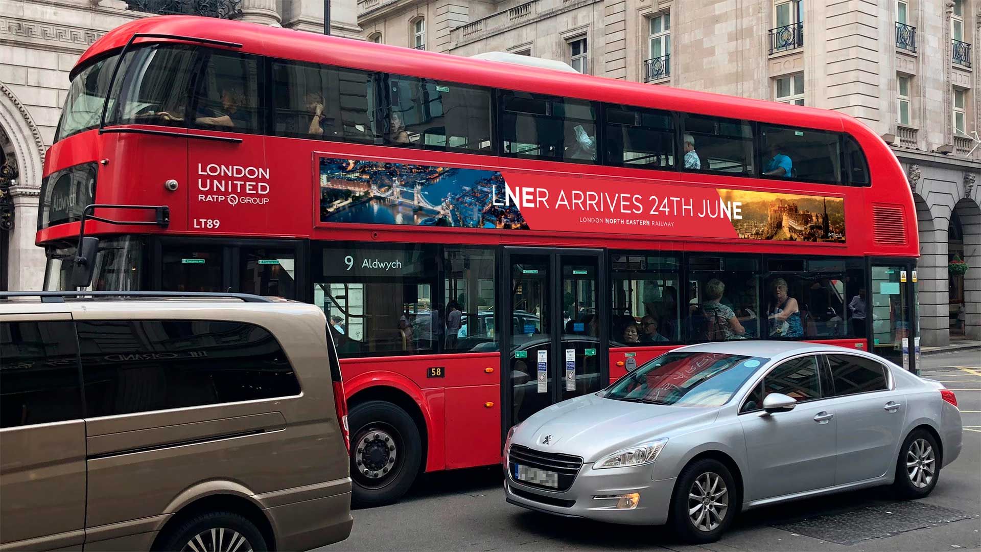
Advertising
Gary Cooke has delivered an outstanding new brand for a new railway. In almost impossibly short timescales Gary created and managed a dynamic new image to universal acclaim. His energy and enthusiasm inspired the team and, through true collaboration, made the outputs striking and believable. We could not have had a better start to a new business”
Tim Buxton, LNER Transition Director
Our Idea
The transition from Virgin Trains East Coast (VTEC) had to be smooth one and it also needed to be cost effective. To bring back the ‘Apple Green’ or ‘Garter Blue’ colour palette from LNER’s glory years, when interiors of the new VTEC Azuma fleet had already been agreed and produced, would have been a costly exercise. We also wanted to make sure the rebrand from ‘Day One’ was credible and not a sticking plaster exercise, and where possible we produced new collateral from scratch.
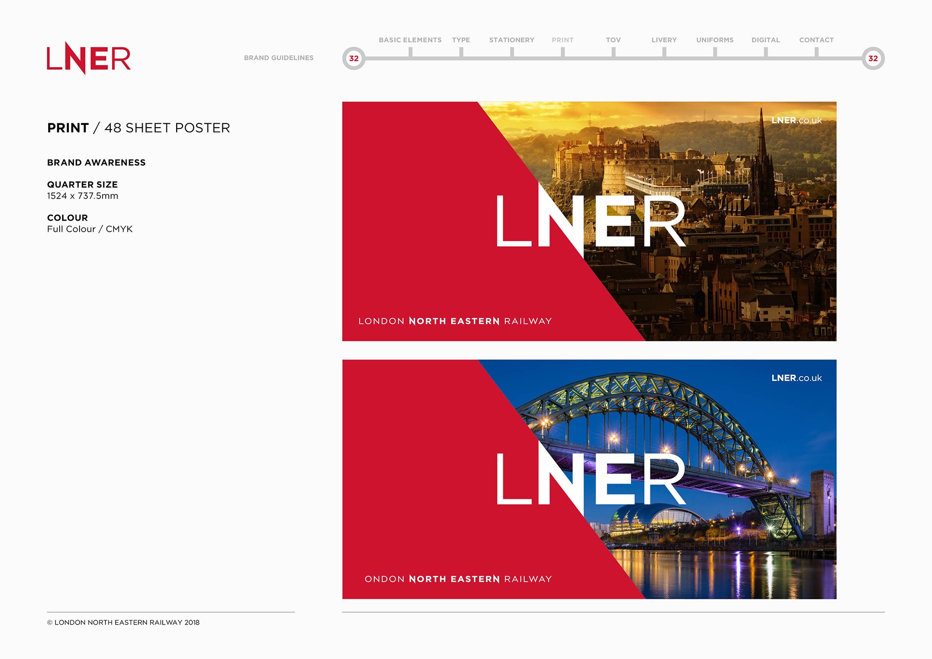
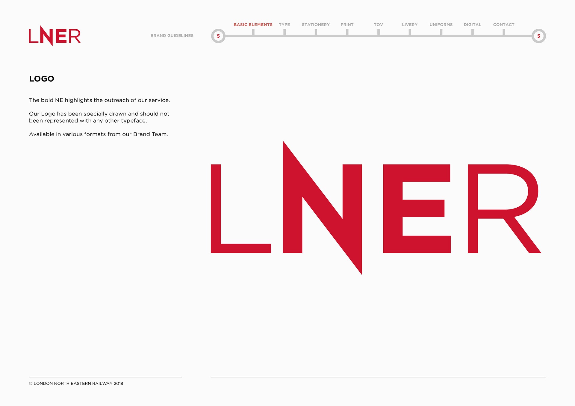
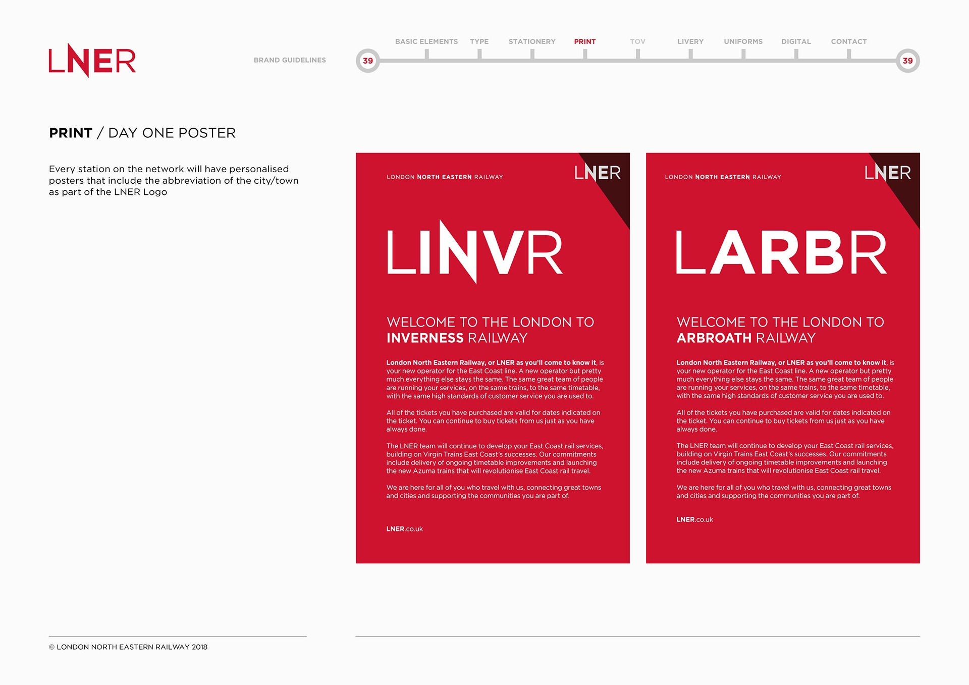
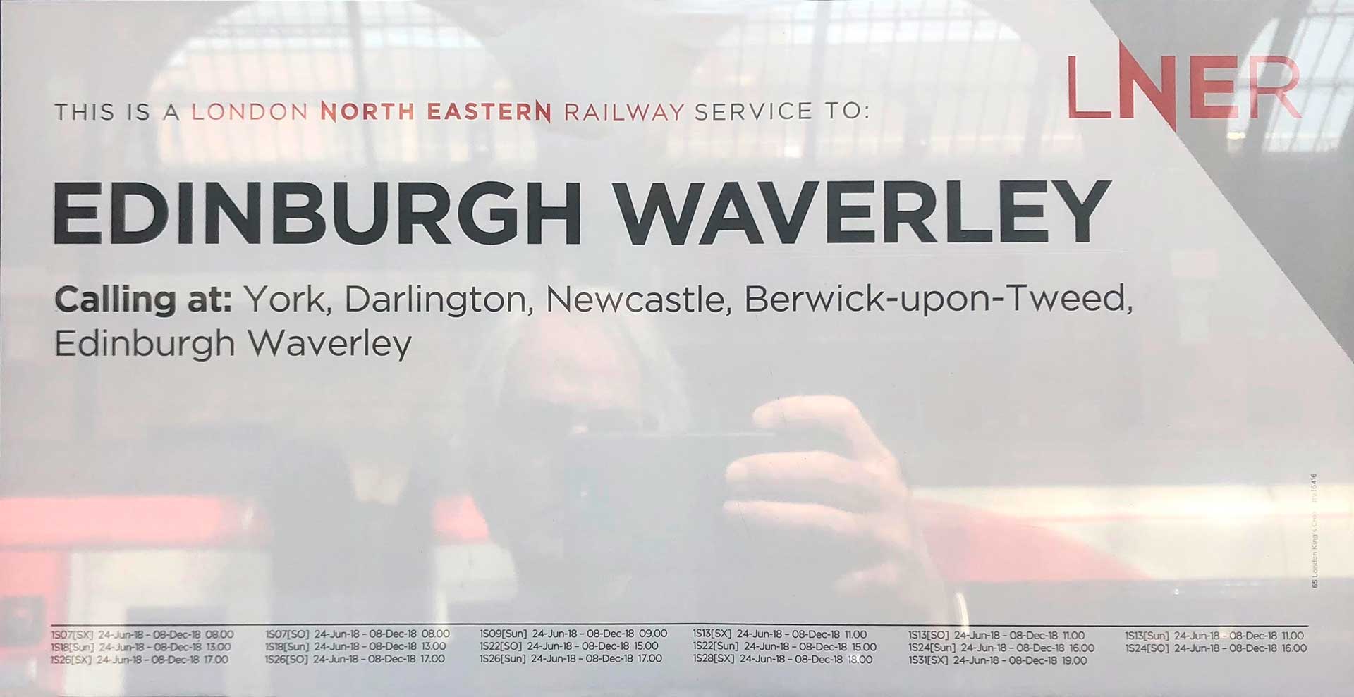
The bold but simple typography of LNER and the dynamic directional N acts as bold divider device for colour and images. Not everyone will know what LNER stands for so we also designed a descriptor to spell it out.
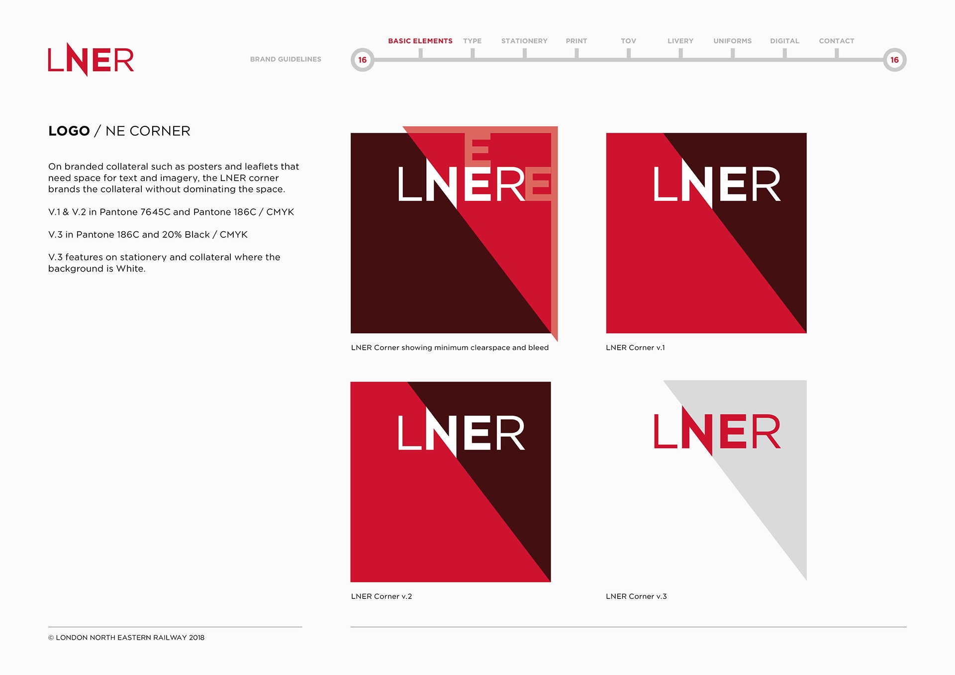
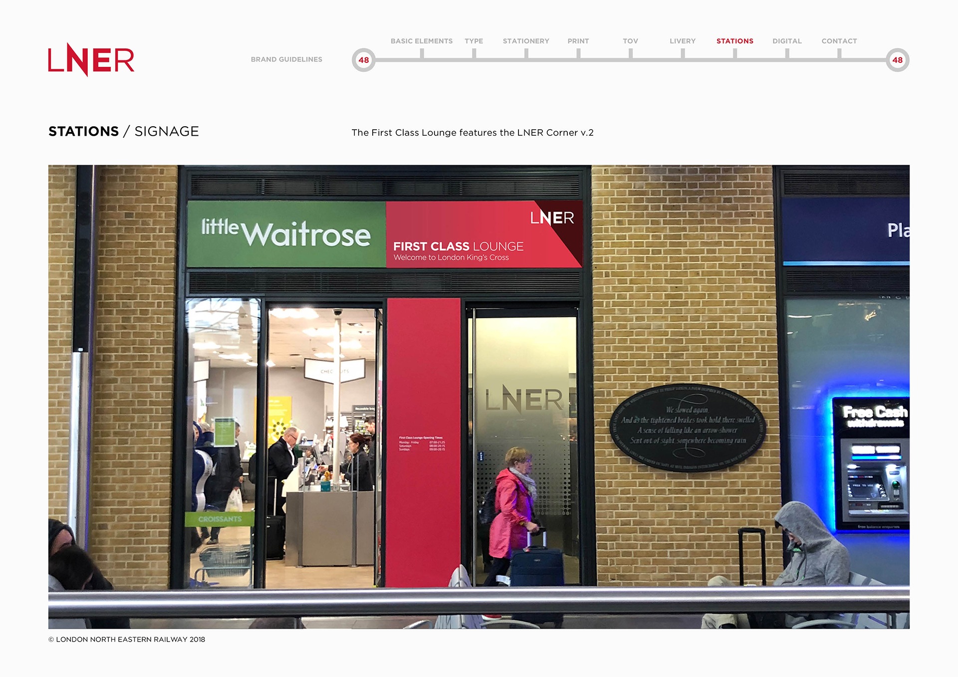
We developed a secondary logo device, which we call the ‘North East Corner’, which always appears in the top right hand corner.
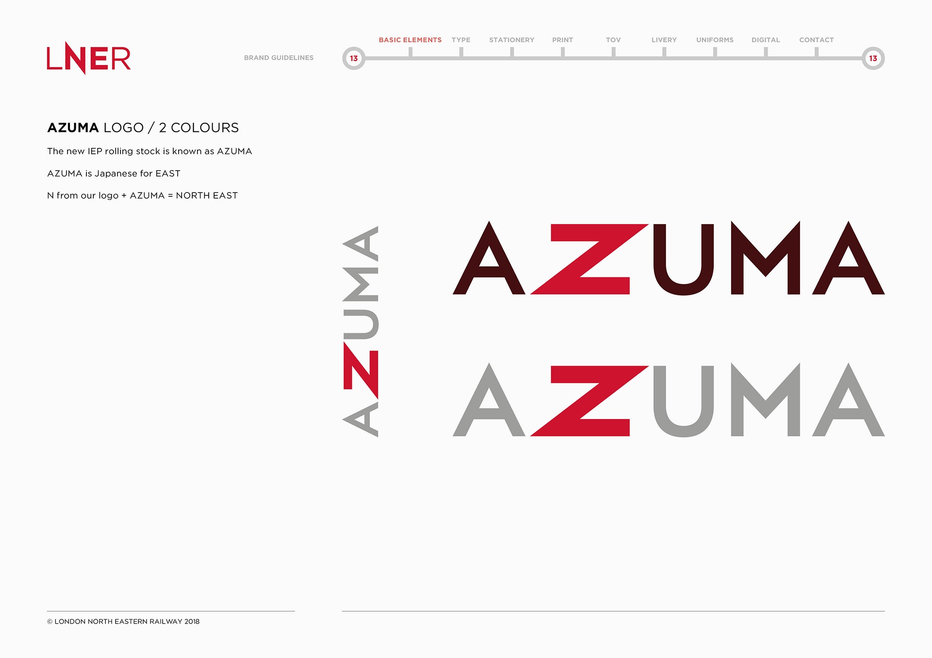
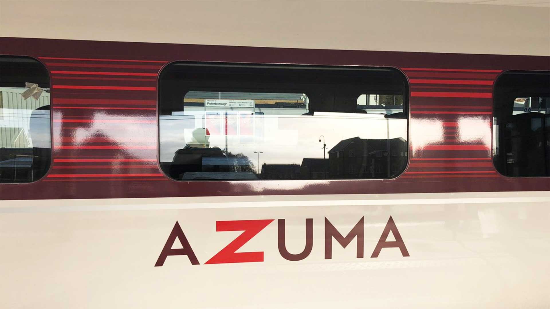
AZUMA, the name of the new InterCity Express trains, was created and marketed by VTEC and so is familiar to passengers on the East Coast line. It made sense to build on this awareness. Azuma is Japanese for East and by integrating the letter N from LNER to form the letter Z in AZUMA, the logo spells out North East.